The warmest April since 1991 with below average precipitation
April was over 2 degrees warmer than average making it the warmest April we have seen in the 10 year history of the UW weather station. Going back even further, I could find one year (1991) that was tied with this year and had to go back even further (1968) before I found one that was warmer.
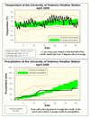
After a very cold March that left lots of snow on the ground at the beginning of April, the switch really turned on the 17th with 9 of the next 10 days reaching a high above 20 degrees.
When the temperature went above 20 on April 17th at 4:00 pm we could declare Kimi Noguchi the winner of this year's UW weather station contest, I also liked his reason for choosing that date: "Based on my statistical knowledge, among all the available choices, I chose this date and time". Congratulations also go out to Stephen Drew and Carrie Warner, the second and third place winners.
April was the first below average month for precipitation since October of last year. We only had 53.8 mm compared to the average of 76.9 mm and only 10 mm fell during the last half on the month.
Even with this dry month, the wet start of the year means that we are still above average for 2008 with 320.3 mm so far, compared to the 264.4 mm we would expect.
As the conditions don't seem to be there for any snow in the short or long term forecast let's call an end to the 2007-2008 snowfall season. Thus we ended up with 257.5 cm breaking the previous record snowfall season of 245.3 cm in 1923-1924.
Environment Canada prediction of temperature for the month: Below average
Actual Temperature: Above average
Summary for April 2008:
Maximum Temperature 24.0 °C
Minimum Temperature -6.6 °C
Average Daily High Temperature 14.1 °C
(Long term average 11.2 °C)
Average Daily Low Temperature 2.1 °C
(Long term average 0.4 °C)
Total Precipitation 53.8 mm
(Long term average 76.9 mm)
(Long term averages based on 1970-2000 data for the Waterloo Wellington Airport)
Sign up to get the monthly weather station summary by e-mail


6 comments:
can you explain why the 'average zone' on your graphs extend higher than the extreme prepitation levels?
i assume it has something to do with statistics, vs actual readings ...
hmmm.... I don't see the "average" zone extending higher than the extreme precipitation values. I am interested in knowing though how the "average zone" is calculated. Is it the average value + 1 (or more) standard deviation?
I asked about this before. The average and extreme are from different datasets (as I recall), the longer airport record, and the weather station.
Answer to the question why the extreme lines sometimes touch the average zone:
The reason is that the averages are based on the Waterloo Wellington airport data from 1970-2000 while the extreme values are for the 10 or so years of data we have from the UW weather station.
The generally accepted standard is that you need about 30 years of data to have meaningful averages, so we will have to wait for a while to use our own averages.
I could solve the problem by also using extreme values from the airport, but I think that it is interesting to see the difference in these data sets.
Answer to the question of how we calculate the average zones:
There isn't a real standard for figuring out these average zones. We made up our own method for temperature, while the one for precipitation we use was developed for classifying forecasts but we think that it gives a good representation of the average values.
For temperature:
The band connects the average daily high temperatures and the average daily low temperatures for each day. So theoretically in a perfectly average month the measured temperatures would fit in the band. We think it shows more than just a line that represents the daily average temperature.
For precipitation:
To get the average band, we put the 30 years of precipitation data between 1970-2000 in order from lowest to highest. The top 10 are considered above average, the bottom 10 are below average and the middle 10 are the average. The band represents the readings for those middle 10.
Probably not the best spot to ask this..
How do you think that the changes to terrain around the weatherstation will impact the year to year comparisons?
Post a Comment